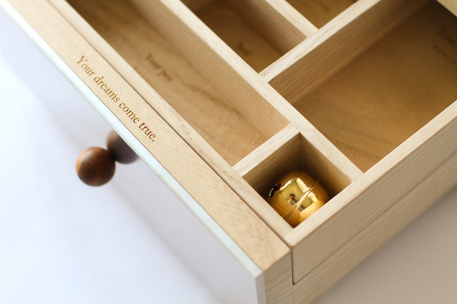
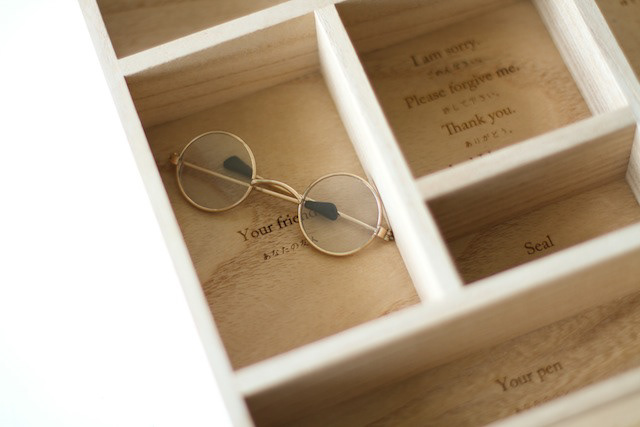
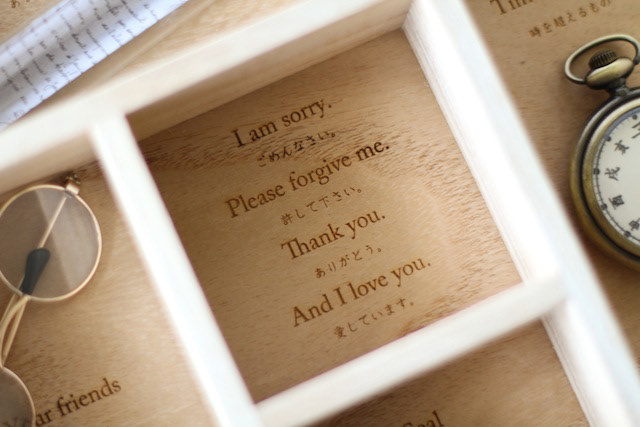
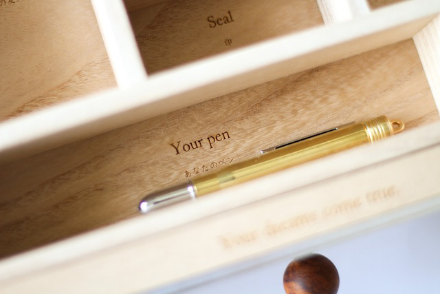
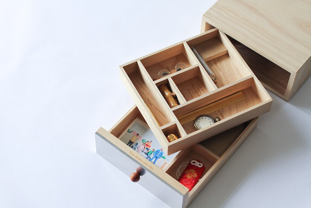
You may also like

OIDEN FESTIVAL
豊田おいでんまつりは、おいでん総踊りと花火大会の構成で始まりました。おいでんの曲にあわせて工夫をこらした衣装で踊ります。初めての人でも参加可能な踊りでオープンな雰囲気が特徴です。 踊りと同時に開催される花火大会は東海地区最大の花火です。踊りと花火が一緒になっている祭りは国内でも珍しく、そのダイナミックで躍動的な姿をイメージし、踊りの舞を残光として表現し、美しい花火の光も重ね合わせたポスターとしてデザインしました。日本の美しい夜の祭を描きました。 The Toyota Oiden Festival began with the Oiden So Odori dance and a fireworks display. The dancers wear ingenious costumes and dance to the music of Oiden. The dance is open to even first-time dancers and is characterized by its open atmosphere. The fireworks display held at the same time as the dance is the largest fireworks display in the Tokai area. It is rare in Japan to have a festival that combines dancing and fireworks, and we designed this poster to express the dynamic and dynamic image of the dancing as afterglow, superimposed on the beautiful light of the fireworks as well. We depicted a beautiful night festival in Japan.
2023
ACRYLIC TOILET SIGN
LEDを内臓したアクリルのトイレサインです。サインのベースは木製でLEDが内臓されています。アクリル部分に切削加工が施されてあり、光を拡散し発光します。Acrylic restroom sign with built-in LEDs. The base of the sign is made of wood and contains LEDs. The acrylic part is machined to diffuse light and emit light.
2020
IKA'S MONO
旧伊香郡4町のアンテナショップIKA'S MONO STOREのブランディング、パッケージデザインなどです。四つの町が一つになって高みを目指す。というイメージでロゴデザインをしました。イカのイメージでパッケージにもヘッダーを作って様々な業者の商品に統一感を持たせて販売しました。This includes branding and package design for IKA'S MONO STORE, an antenna store for four former Ika-gun towns. The four towns are united as one and aim high. We designed the logo with this image. We also created a header on the package with the image of squid to give a sense of unity to the products of various vendors and sell them.
2019
RED Animal Crayon
2012
ZIPANG
日本列島を模した信楽焼の器です。食卓に日本列島を描いて楽しめます。 あまり具体的な日本列島にならないように、言われたら、わかる。くらいの、抽象的でかわいい日本列島のデザインとしました。 This is a Shigaraki ware vessel in the shape of the Japanese Islands. You can enjoy drawing the Japanese Islands on your dining table. The design is abstract and cute, so as not to be too concrete. The design is abstract and cute.
2022
GOENMAN
ご縁まんは、菓匠禄兵衛の商品でおめでたい縁起の良いイメージでパッケージを依頼されました。紅白と金色を用いて「円」と「縁」を掛け合わせて縁起の良いデザインを目指しました。e were asked to create a package for Gohan Man, a product of the confectioner Rokubei, with a festive and auspicious image. We aimed to create an auspicious design by using red, white, and gold colors to cross the words "yen" and "en" together.
2020
SAKAEYA
肉サカエヤのCIデザインを担当しました。牛という文字を使いながら和にならない洋のイメージを感じさせるデザインとし、ナイフで切ったような手作り感、クラフト感のあるロゴデザインとしています。We designed the CI for Sakaeya Meat shop. The logo design uses the character for "beef" but gives a Western image that is not Japanese, and has a handmade, crafty feel as if it were cut with a knife.
2019
BIWAKO HOMARE
近江茶 琵琶湖ほまれのパッケージデザインです。茶の栽培地である、三重県境から琵琶湖まで繋がっているというイメージを水彩画で表現しました。This is the package design for Omi Tea Biwako Homare. The image of the connection from the border of Mie Prefecture to Lake Biwa, where the tea is grown, is expressed in watercolor.
2021
220
220は特殊な触媒を用いて飲料の味を変化させる魔法のマドラーです。数秒かき混ぜるだけでワインが熟成されたような味になります。プロダクトデザインは秋田道夫氏、ブランディングを弊社が担当しました。220 is a magic muddler that uses a special catalyst to change the taste of beverages. Just a few seconds of stirring is all it takes to make wine taste like it has been aged. Product design was done by Michio Akita and branding by our company.
2022
amana
「あまな」は近江八幡丁稚羊羹の老舗和た与の経営するカフェです。そのインテリアデザインを担当しました。外観は和風であり、テイクアウト導線も設けました。モダンな和、円をテーマにしてデザインしています。Amana" is a café run by the long-established Ohmi-Hachiman Decchiyokan (sweet bean jelly) shop, Wataoyo. We were in charge of the interior design. The exterior is Japanese style, and a take-out line is also provided. The theme of the design is modern harmony and circle.
2020
Back to Top